
Mastering Data Visualization with AI and ML Courses in Bangalore
How AI Training in Bangalore Sparked My Journey into Python Visualization

Turning Raw Data into Powerful Stories: My AI & ML Journey
Not long ago, I was staring at rows and rows of CSV files, unsure how to interpret any of it. Numbers made sense, but I couldn’t “see” what the data was trying to tell me. That’s when I enrolled in one of the AI and ML courses in Bangalore, hoping to make sense of the chaos.
What I discovered wasn’t just a skill—it was a new way of thinking.
The First Step: AI Training in Bangalore
The course began with the basics: Python programming, understanding machine learning models, and algorithms. But what intrigued me most was data visualization—the process of translating complex datasets into graphs, plots, and visuals that even non-technical stakeholders could understand.
And it wasn’t just about making things look pretty. It was about revealing truths hidden in the data.
At the AI training in Bangalore, we explored tools like:
- Matplotlib: the go-to for static, animated, and interactive plots.
- Seaborn: perfect for statistical visualizations with style.
- Plotly: great for interactive, web-ready charts.
- Pandas: not just for data manipulation, but also for quick visuals.
Learning by Doing: Visualizing a Real Dataset
In one of our early assignments, we were given a dataset from an e-commerce platform. Our goal was to identify buying patterns during different hours of the day and present them using Python.
Here's how I approached it:
🧠 Step 1: Data Cleaning
Using Pandas, I filtered out null entries, removed duplicates, and converted timestamps into readable formats.
df['Time'] = pd.to_datetime(df['Time'])
df['Hour'] = df['Time'].dt.hour
📊 Step 2: Initial Visualization
I used Matplotlib to create a simple bar graph.
plt.figure(figsize=(10,6))
df['Hour'].value_counts().sort_index().plot(kind='bar')
plt.title("Transactions per Hour")
plt.xlabel("Hour")
plt.ylabel("Number of Transactions")
plt.show()
🔍 Step 3: Advanced Patterns
Seaborn helped me visualize multiple variables, like product categories and transaction amounts.
sns.boxplot(x='Category', y='Amount', data=df)
The visuals clearly showed peak hours and high-value categories. It was like discovering gold hidden in plain sight.
Why Visualization Matters in AI & ML
In any AI or ML project, whether you're predicting customer churn or identifying fraudulent transactions, data visualization plays a key role in:
- Understanding data distributions before model building
- Detecting outliers or anomalies
- Communicating results to non-technical teams
- Improving model performance through better feature selection
- Good visualization isn’t just cosmetic—it is foundational.
The Turning Point: My First Internship
After a few months in the program, I landed an internship with a fintech company in Bangalore. My first project? Build a dashboard using Plotly Dash to monitor real-time loan application trends.
Because of the training I received in my AI and ML course in Bangalore, I was not only able to complete the project ahead of schedule but also suggest additional KPIs the team hadn’t considered.
That moment changed everything. I realized that data visualization wasn't just about graphs—it was about influencing decisions and guiding businesses.
Lessons I Learned Through Visualization
Here are some key takeaways that I still use today:
- Less is more: A simple graph that tells a story is better than a cluttered dashboard.
- Know your audience: Technical teams want different visuals than executives.
- Interactivity increases impact: in AI models, where decision paths can be complicated.
- Storytelling is key: Every graph should answer a question or raise a new one.
If you’re diving into the world of AI and ML, don't just focus on models and algorithms. Learn how to present your insights through clear and engaging visualizations. It’s one of the most underrated—but essential—skills in tech today.
Are you someone who enjoys working with data but struggles to communicate your findings effectively?
Or are you looking to make your resume stand out with real-world AI and ML projects?
Start with visualization. It’s your first step toward becoming not just a data scientist—but a data storyteller.
Institutes like Eduleem School of Cloud and AI are equipping students with the tools and mindset needed to master both the logic and the creativity behind AI. Their focus on hands-on training makes them a strong choice for aspiring professionals in Bangalore.
Have you ever created a data visualization that wowed your teacher or manager?
What tools or libraries do you love using for Python visualizations?
Drop a comment below, and let’s explore the art of data storytelling together!
About the Creator
Keep reading
More stories from Ayaaz Ghalib Mohammad and writers in Education and other communities.
Mastering VPC Traffic Security with AWS Training in Bangalore
Before enrolling in an AWS course in Bangalore, I was just another junior network engineer, juggling routers and switches, craving something more challenging. Cloud was the buzzword I kept hearing, but for the longest time, it felt overwhelming.
By Ayaaz Ghalib Mohammad11 months ago in Education
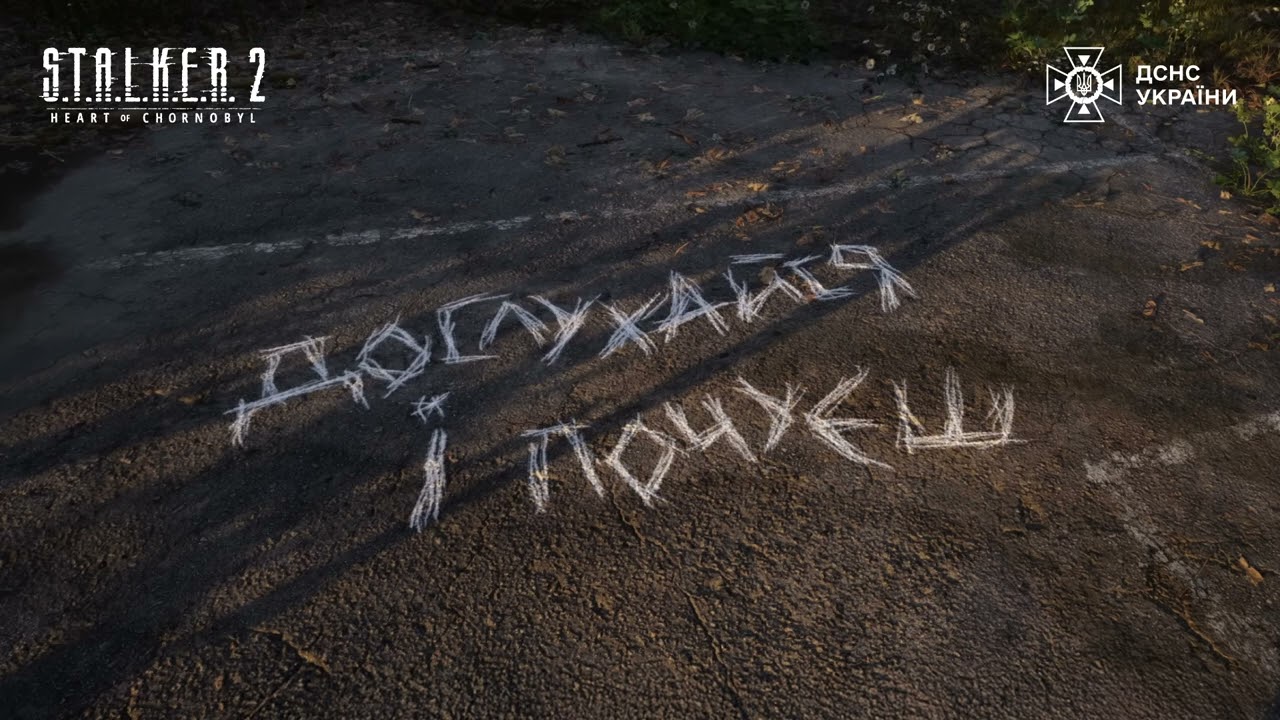
Collaboration Ukrainian Emergency Service and S.T.A.L.K.E.R. 2 after mine safety video goes viral
Ukraine is the most mined country in the world — 139,000 square kilometers are potentially dangerous. This is 23% of the country’s territory. The State Emergency Service of Ukraine (SES) worked in partnership with creative marketing agency Rockets. Growth R&D and GSC Game World to create the project, titled S.T.A.L.K.E.R. 2: The Hidden Threat. The short video is styled exactly like an in-game PDA message familiar to players of the S.T.A.L.K.E.R. universe and features Skif (the main character of the game) addressing viewers directly.
By nana agency4 days ago in Education
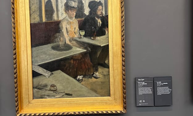
Elderly Woman Behind the Table in a Large Town
The glass of Absinthe sat before me. It’s quite amazing how despite such terror rendered upon their stones in the preceding decades, these streets still held the beauty I first read about as a girl. I never dreamed I’d set foot on these cobbles, at least not safely.
By Matthew J. Fromm6 days ago in Art


Comments
There are no comments for this story
Be the first to respond and start the conversation.